
11 Landing Page Best Practices
- Make your offer relevant and valuable to your prospect
- Your headline should be benefit-focused
- Your image should illustrate your offer
- Show prospects what action you want them to take
- Your lead form is in-view on page load
- Your call-to-action is punchy and clear
- Only ask for what you need
- Remove all navigation
- Make your page responsive
- Optimize for search
- Remember to use a thank you page
Let's go into these Landing Page Best Practices in more detail.
Make your offer relevant and valuable
You're offering up content in exchange for your lead’s personal information. To make this a fair exchange, your content should be compelling enough for your visitor to provide their contact info. Your content offer should be relevant to the prospect's stage of the buyers journey, as well as to your business: think of this as one step towards the sale of your ultimate product or service.

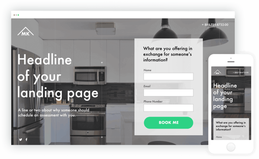
Headline = benefit focused
Your visitors need to know what's in it for them within seconds of arriving on your landing page. Your headline is the first thing they’ll read, and it should clearly and concisely communicate the value of your landing page and offer.
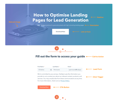
Your image should illustrate your offer
Yes, an image is mandatory, and it should represent your target audience. The purpose of your image is to convey a feeling — it should illustrate how your visitor will feel once they receive your offer. Certain images work better than others, so you should always split test your options (which we’ll cover below).
Show your prospects what action you want them to take
Less is more: write clearly and concisely. This is about taking action: your visitor should know at a glance what action they're encouraged to take. Speak directly to the visitor with words like “you” and “your” to make them feel engaged.
Your lead form is in-view on page load
Your form should be in-view as soon as someone hits the page: they shouldn't have to scroll-down to find it.
Even better: Design your form to scroll with the user as they move down the page.
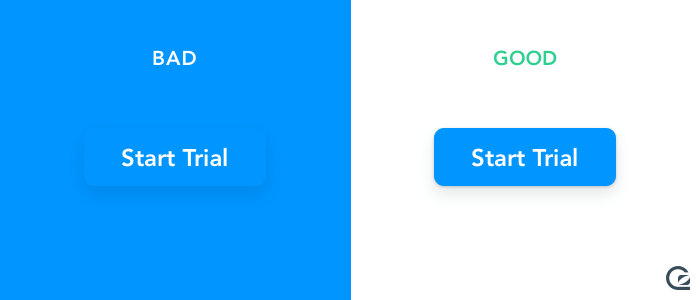
Your call-to-action is punchy and clear
The CTA button is critical: it needs to stand out, so choose a button colour that contrasts with the rest of the page. Use an action verb on the button that spells out what action you want the prospect to take, like “submit”, “download”, or “get it now”.
Only ask for what you need
You want to gather as much information as possible about your lead, but how much you ask for depends on several factors: how well acquainted they are with you, where they are in their buyer’s journey, and how much they trust you. Ask for as little info as you need in your lead form to create a low barrier to entry. A name and an email are more than sufficient to nurture a new lead.
Remove all navigation
Your landing page has one objective and one objective only: to convert visitors into leads. Any competing links — including internal links to other pages on your website — will distract from that goal. Remove any other links on your page to draw all of your visitors’ attention to your call-to-action.
Make your page responsive
Just like every other page on your website, your landing pages need to be responsive to accommodate every viewing experience. The last thing you need is for your form to fall out of view on mobile devices. Give your visitors every possible opportunity to convert, no matter how they’re viewing your page.
Optimise for search
Sure, you’ll be driving visitors to your landing page through email blasts, social posts and other marketing methods but your page should also be optimised with target keywords for your paid campaigns and organic search. When someone searches for your key phrase, they should find your landing page. Similarly, when you target a keyword with paid ads, those words should exist on your landing page.
Remember to use a thank you page
A thank you page is where you send leads once they’ve completed your form. A thank you page serves three important purposes:
1) it delivers the offer that you promised (usually in the form of an instant download),
2) it gives you an opportunity to interest your new lead in additional relevant content, and
3) it serves as a chance to thank them for their interest, which goes a long way in promoting them to a customer down the line.